Pillar
Business bank accounts that just work.
So that you can get back to business.
Our Impact
- Naming & Branding
- Value Proposition
- Challenger Brand Strategy


THE CHALLENGE
When Pillar Financial engaged 5&Vine, it was preparing to launch a modern banking solution for Canadian SMBs. It required a powerful and trusted brand identity that resonated with both tech and traditional entrepreneurs.
Our team was engaged to develop that strong brand. One that resonates with the target and enables Pillar to win businesses that are just starting out and those that already have an established banking relationship.


OUR APPROACH
Our approach consisted of assessing competitors in Canada and the US to infer customer profiles and understand who the underserved customers are.
We endeavored to understand whether the rhetoric of fintech companies aligned with their actions and scrutinized the fine print of competitors by grasping the business, financial model, service offering, competitive set at launch and the future road map.
We found that where many fintech companies aim to be welcoming and inclusive, regardless of company size, the fine print revealed steep minimum revenues. We positioned the company as the antidote to fintech competitors that appear inclusive, but focus on serving classic tech founders rather than self-employed individuals, freelancers, entrepreneurs and small businesses.
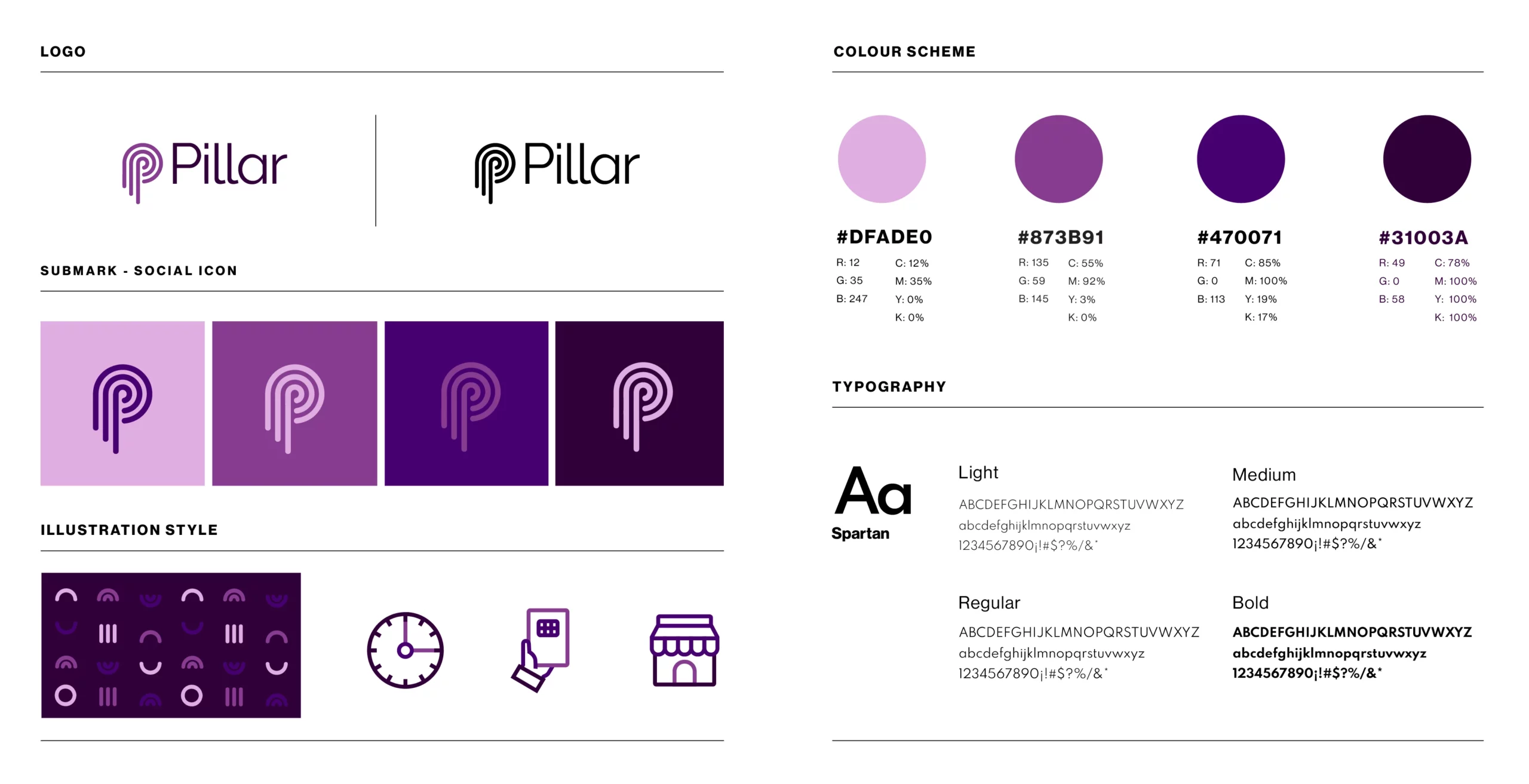
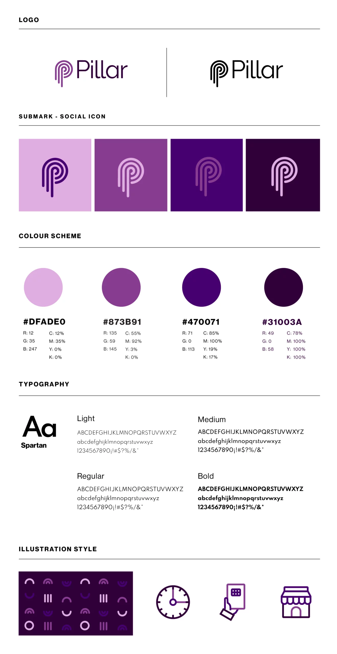
To realize this, we worked on the brand’s logo and guidelines, mapping colour schemes and visuals of competitors to identify their commonalities and differences, and used symbolism to connect to the category and their value proposition.
We chose purple as a standout to the traditional banking colors of green, blue, and red, and the neo-bank colors of orange, black, and white.
The logo was inspired by historical Greek and Roman pillars used to support and uplift while also alluding to the entrepreneurial journey and idea of collaboration needed to succeed.
READ MORE


THE OUTCOME
Small businesses and entrepreneurs are essential to Canada’s economy. They’re the backbone of our workforce, pillars of our community, and innovators that shape our future.
We positioned Pillar to be the all-in-one financial solution, purpose-built to support their visions and help make their plans a reality.
We guided Pillar in defining its mission to level the playing field by giving every Canadian business access to simple but sophisticated enterprise-grade banking products, and empower entrepreneurs across every sector to feel like respected business owners from day one.
We also ensured Pillar was seen as the brand to arm freelancers with the insight they needed to feel financially confident.
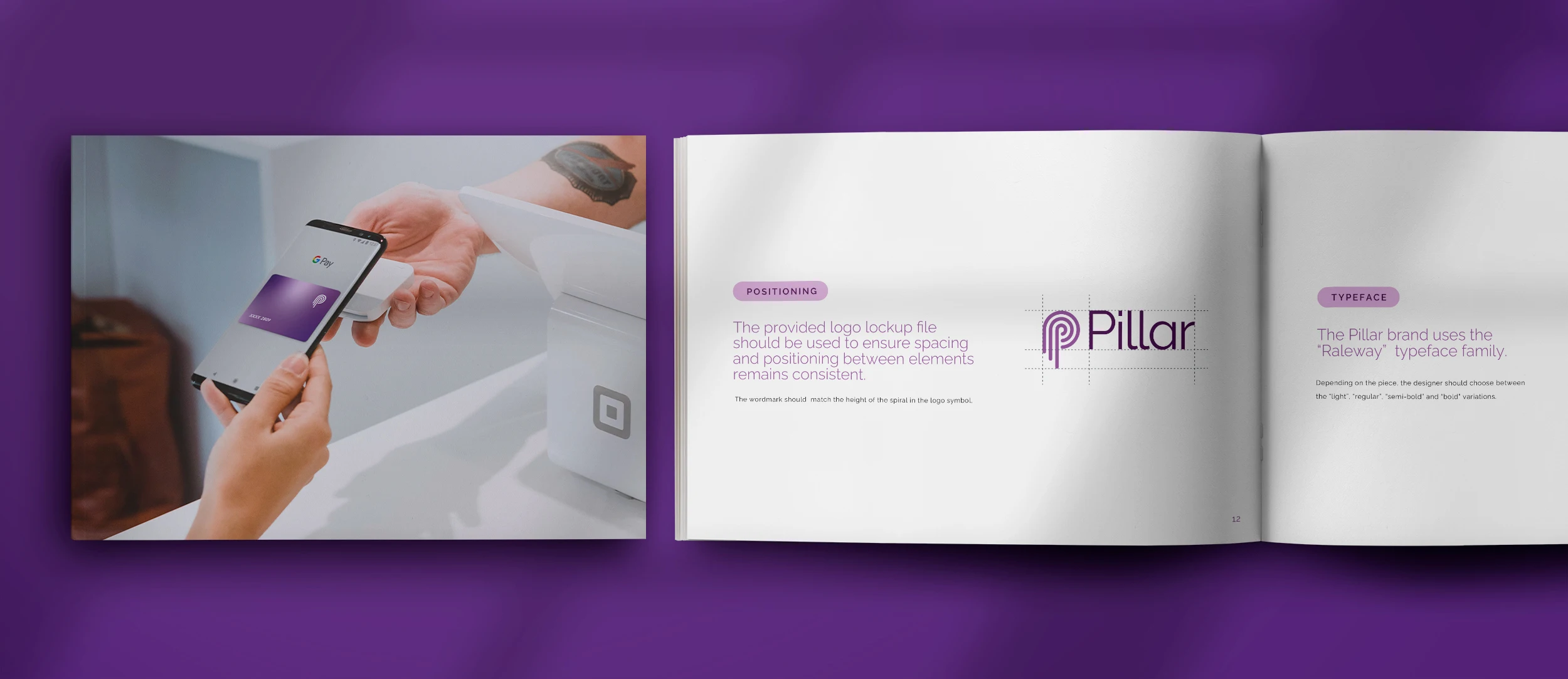
Finally, we codified the newly defined brand in a manual that included card designs, and set the team up for success to launch their fully defined brand.


